Sunday, October 31, 2010

Recipe: squish, stretch, and heat

Textures used include copy paper, string, rubber bands, silly string, plastic wrap, ace bandage, duct tape, thumb prints, tissue paper, board seam tape, foam packing and glue.


I used crayons, glue sticks, ashes and burned wood, candle wax and various burners on paper, cardboard, foam, and transparencies.

Saturday, October 30, 2010

October 29, 2010 Lecture

First wave feminist art and the ripples before and after

Feminist Movement:
  1. The essentials:  Key elements were about identity, the personal, the feminine body, sexuality, vaginal iconography, and affirming female attributes.   Woman as defined by women and not men.
  2. Materials and techniques unique to woman such as weaving, jewelry, dishes, and crafts.
  3. Activism:  performance art as a means to find voice from women's viewpoint, engage the public and create sisterhood.
  4. Distinguish art between women and men.  Tension in movement, if separate get, "That's pretty good for a girl".  Women's art was personal and about bodies, conceptual.  Men's art was theoretical.
Feminist artists:
  • Frida Kahlo - work from the psychological and dream point of view, very personal.
  • Georgia O'Keeffe - female genitals through flowers
  • Marrianne Brandt - works of metal include objects women are associated with such as lamps, tea cups, etc.
  • Adrian Piper - performance art about her identity as a black woman. 
  • Judy Chicago - installation of painted china and creating place setting for different female artists.  A statement about traditional women's work.
This movement portrays the advancing of women's rights such as the right to vote, the right to have control over their own bodies with birth control and the Equal Pay Act.  It deals with identity, iconography, and taking back the definition of woman.

2D New Textures/Color Studies

Color palette of choice

Friday, October 29, 2010

3D Self Portrait Progress

 Blind Project


Finally, all glued together and ready for assembly.

I started out to combine the small and the large cube but I didn't like the shape.  It took away from the simplicity of form.


All lined up and ready for the contrasting core.


Tuesday, October 26, 2010

Stained

Coffee filters, paper, and t-shirt material


The dirty stain makers (kool-aid not shown)


2D Texture/Color Studies


Urban

I used bristol board and black foam with a can opener, plastic wrap, a garlic thingie, and a cork.  I liked the bottle opener the best.


Rural
In this group I use bristol board and sand paper with
cheese planes and plastic wrap.

Residential

Materials include bristol board and tissue paper marked with corks and plastic wrap.


Industrial


 I enjoyed this group the most.  I liked the colors and mark making tools.  Again I used the plastic wrap and garlic thingie along with a garlic press and fiberglass seam tape all on bristol board.

Final Poster

Saturday, October 23, 2010

October 22, 2010 Surrealism Lecture

Surrealism

Surrealism's literal meaning is beyond reality.  It started in Paris in the 1920’s after World War I.  It's roots were found in Dada, but it was less political and more artistically based.  It's goal was to create a shocking response in the viewer out of the everyday or expected norms of the bourgeoisie socio-economic class.  This was often very disturbing.  In response to Sigmund Freud's studies of the subconscious mind and dreams, artists fused the psychological dreamlike and fantasy states with the everyday.  The influence of fantasy in art has always been and surrealist artists continue to influence all genres today.

Features:
  • less political ??
  • new psychological theories of Freud and his book, The Interpretations of Dreams, 1899
  • access to the subconscious mind
Artists:
  • Max Ernst
  • Rene Magritte
  • Salvador Dali
  • Giorgio De Chirico
  • Man Ray
  • Jean Arp
Stole from Dadaism:
  • automatism/chance
  • continued rebellion against traditional art
  • use of cubism
Examples of listed artist's surrealist works:
  • Max Ernst, "Eye of Silence", 1925.  Opened top of head and dumped everything out.
  • Rene Magritte, "False Mirror", 1928. All about what it is a picture of.  Destroys expectations.
  • Salvador Dali, "The Persistence of Memory", 1931. Combination of the everyday and the dreamlike.
  • Giorgio De Chirico, "....with Biscuits", 19??. Cubist influence but doesn't take it to abstraction.
  • Man Ray, "Object to be Destroyed", 1923.  Hypnotic and dreamlike.
  • Jean Arp, "Collage of Squares Arranged According to the Laws of Chance", 1916-17. Not total chance, just use chance to spark creativity.

October 22, 2010 Color Lecture and Reading

The Element of Color


Color Theory - the art and science of color interaction and effects.  The artist uses color wavelenghts to create intended visual effects, is aware of safety and permanence of pigments/dyes, is aware of our brains reaction to color and light, and what color and light communicate to us psychologically.

Color Physics - Two major color systems.  1)  Additive colors are the light (beam) primaries and the colors created by their mixtures.  These colors include red, green, and blue or RGB.  2)  Subtractive colors are pigment primaries or reflected light off a pigment.  These colors include cyan blue, magenta red, and yellow.  In mass production transparent primaries or process colors are used which include the above mentioned subtractive colors plus black or CMYK for added detail and contrast.

Color and Light - A prism bends white light creating the color spectrum of hues.  Each color has a specific electromagnetic wavelength, red has the longest and violet has the shortest.  Color wavelengths are either reflected or absorbed according to the color of the surface.  Color reflection and absorption are not absolute.  The dominant colors can have variations of other colors within them.

Additive Color - Influenced by intensity of light, the light source (fluorescent or incandescent), the surface quality as in textured or transparent, and the ambient or overall light.

Subtractive Color - Color overtones are secondary hues within primary colors (ex. alizarin crimson with violet overtones).  Achromatic is black and white and has no hue.

Color Interaction - the way colors influence one another and us.  We define color according to our emotional life experiences.  Lighting effects how we perceive color by casting hints of other colors.  Also, simultaneous contrast of color as in light/dark contrast, complementary colors next to each other, and the effect of how color changes when placed on different background colors.  The Bezold effect is the change of a single color that changes the pattern.  The opponent theory is when the brain can only see one complimentary color at a time and is exhausted by looking at one for a period of time and then looking at a white background causing the brain to see the opposed color or afterimage, as from red to green.
  • Hue - Literal color or location in the color wheel.  Primary colors are red, blue, yellow, secondary colors are green, orange, violet, and tertiary colors are a mix of the secondary color and the adjacent primary color.  Temperature is the energy or heat a color generates physically and psychologically.  Warm colors advance and cool colors recede.  All hues can have a warm and cool range.
  • Value - lightness/darkness. Tint is when white is added to a hue changing the value.  Tone is when gray is added and the shade is when black is added.
  • Saturation, Chroma, Intensity - purity or richness of color.  The distance from neutral gray or how much gray is in the hue.  The primaries are the most intense.  They become less so when mixed with other colors.  The value stays the same.
 Color Schemes - used to create color harmony.  The hues on the color wheel don't naturally exist.  In art, what really makes a difference is contrast.
  • Monochromatic - Variations of one color creates strong unity but can be boring because it lack variety.
  • Analogous - Adjacent colors on the color wheel also creates strong unity because it creates more interest.
  • Complementary - Opposite colors on the color wheel.  They each play off the energy of the other.
  • Split Complementary - Uses two colors on either side of a complementary color.
  • Triadic - Triangulating colors on the color wheel.  Used when variety and strong impact are necessary.
  • Chromatic Grays - Mixes different hues instead of just black and white and creates a subtle effect.
  • Earth Colors - Made from pigments found in the soil.  Creates analogous harmony.
  • Disharmony - Can be as effective as color harmony.  Is used when subject matter is disturbing or an unusual impact is needed.
Composing with Color
  • Illusion of Space - Using warm and cool colors, space can expand or contract.  
  • Weight and Balance - Colors can give a composition visual weight and balance to increase the dramatic effect. 
  • Distribution and Proportion - Can harmonize incompatible colors.
  • Emphasis - Color can emphasize important information or create a focal point.
Emotion and Expression
  • Color Keys - The dominant color that has a psychological and compositional impact. Use of a dominant color can be used to create intense emotion rather than duplicate reality.
  • Symbolic Color - Colors have different symbolic meanings according to culture.
  • Expressive Color - Color and value can create different moods from simplicity to the more dramatic. 

Thursday, October 21, 2010

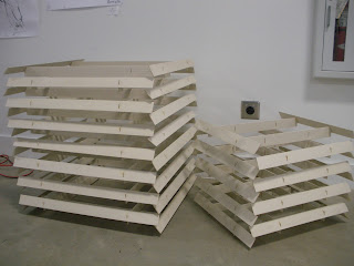
3D Modular Critique

Coffee Anyone?


After getting to class Monday and finding my project on the floor, I really didn't think there was any way to redeem it.  All the areas of definition were gone.  I worked on it at lunch and it looked a little better.  I continued working after class and was hit by a wave of inspiration.  I think the fall was an improvement.

I enjoy the critiques because I learn so much and hope I will soon feel more comfortable in the 3D area.  The good parts of my project were the movement and the feeling of being suspended in the air.  The top part and the back side were the best because they didn't have as much stuff and there was a better balance of receeding and extending in and out of space.  The hole was too deep for some but then others liked being able to see through from different view points.  The different shades of white caused by denser areas and the shadows cast were a plus.  The occasional ruffles also added interest.

The things that I could have done better were extending the design even more.  There were areas that appeared too thin and looked like a side instead of a complete 360 degrees.  It would be better too if there were no hole or not as deep.  As I worked it was difficult to know when to stop.  As soon as I got one area balanced, another was unbalanced by what I had just done.  I began to think this thing was going to morph into a big white monster and so I stopped.

Wednesday, October 20, 2010

2D Poster Critique and Final Two


Critique by Lauren Martin, Ryan Chriswell, Josh Berrios, Milah Moes, and Cara Wakefield


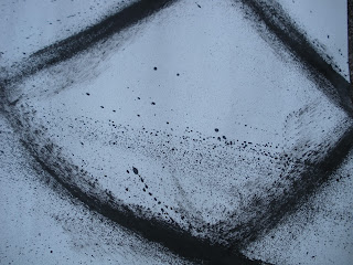
Mark as Meaning:

The group felt there was more than one emotion.  On one hand the darkness felt calming but after looking at the detail in the marks it looked more frenzied.  These details were neutral to masculine.  In the first, the intensity of the black space and the sweeping movement were indications of the masculine.  In the second, there is also some really dark space but it is more balanced by variations of dark to white.  The circular motion is intense enough that they did not see it as strictly feminine, so neutral seemed to fit best.  These marks were described as sounding like crashing waves and jeans rubbing together when someone is walking.  If the sound where a voice, it would be shouting or yelling and be one or just a few.  The real things they saw in the marks were a dragon, a snake, the ocean, and the human form, like an eye.  Lauren felt swirling.

Quote to Read:

They thought the quote was easy to read because the type was large enough. Ryan didn't like the type on the second choice because it felt very backwards to him.  Meredith helped us with this by holding some of our posters at a distance to see if we could still read them.  This made the decision easier.  The visual breaths and pacing between words read well and the words visually sounded like normal speech to them.

Quote as Mark:

In the first poster the quote felt separate from the image because it is centered in the lighter space and in the second they felt the words were a part of the image because it ran along the same line as the image.  The first also contrasts with the image in the light/dark with the text.  The second flows more with the text. 

Quote as Meaning:

This was difficult for the group because the meaning of the quote was ambiguous for them.  They felt it had no meaning.  Meredith suggested that it was more surreal and I would agree.  It is poetic language not speaking language.  The quote is from a song, so if they heard it, it might make more sense to them.  They did feel the quote read as they expected in both with the exception of Ryan, who felt the quote read backwards in the second poster.   The text worked well with the negative space.


#1

#2


Sunday, October 17, 2010

October 15, 2010 3D Lecture

Dada, Surrealism and After


Contributions:

     Appropriation - basically stealing,  reuse in new context to question political, social, or artistic issues

     Assemblage/construction - found objects, influenced by Picasso and technology

     Conceptual Art - ephemeral manifestations

     Chance - began with Dadaists who wanted freedom from social and artistic traditions. 


Dada Artists:

     Hugo Ball - recites meaningless sound poem, Karawane 1916, dressed in cubist costume, industrial
     influence.
     Marcel Duchamp - made fun of the foundations of art.  L.H.O.O.Q. 1919.
     Jean Arp - Collage with Squares Arranged According to the Laws of Chance 1916-17, took artistic
     control out of the equation.
     Kurt Schwitters - Merz 1919, subtle political statements influenced by WWI in collage form.


This movement began as a revolt against the atrocities of WWI  in Zurich, Switzerland in 1916 when Hugo Ball opened Cabaret Voltaire.  It involved protest against the war, society, old world social order, and art itself.  Hitler was starting a war that seemed crazy to German artists and they fled to Zurich.  This was a time of intense uncertainty.  They didn't know when they could go home so they entertained themselves at the Cabaret Voltaire.  As years passed, they began to spread across Europe.  In Berlin in 1919 Dada artists became more political.  In Paris 1924 there was emphasis on poetry and sound language, which later morphed into surrealism.

Up to Leonardo da Vince, artists where workman and focused on beauty for the pleasure of looking.  After WWI, artists were thinkers and wanted to make political and social statements about the contemporary world.  They were anti-everything.  Artists during this movement wanted to throw out the old social orders and create everything anew.  In 1916 collage began when mass printing capabilities advanced which made magazines and newspapers readily available to the public.  It did not exist anywhere prior to 1916.

2D Readings: Introduction To Design

Unity and Harmony

  • Thematic:  The artist's intentional use of similarity in organizing objects, shapes or forms visually.  Themes can communicate emotional meaning beyond what the viewer sees physically.  A theme is visually heard as a melody that plays on the variances of harmony to variety.  The essential components in creating thematic unity are repetition with variety and skill in combining the elements to create compositional unity. 
   
  • Gestalt:  The four main principals are closure, proximity, similarity (or repetition), and continuance.  The sum of the components of a composition have greater meaning than the individual parts.  These components when combined in specific ways can imply movement in their interrelationships.  
                        closure - seeing incomplete forms as complete.  It can incorporate negative space between
                        elements into new shapes and forms.  This adds meaning and interest to the composition.

                        proximity -  placing elements close together in groupings creating a whole structurally.
                
                        repetition - creates patterns that in turn produce rhythms in compositions.  Adding
                        variations creates interest.

                        continuance - use of real or implied lines that guide the viewer around a single composition.
                        Continuity differs in that it involves a series, as in a magazine or book, .
                                     
  • Grid:  A guide of vertical and horizontal lines in a rectilinear arrangement that form a grid pattern for placement of elements to achieve unity compositionally.  The more columns there are the more variety and interest is created.


 Balance

  • Formal - Geometric and symmetric creating a mirror image on both sides of a horizontal axis.  This balance creates a sense of stability.  Symmetrical is one type of formal balance.  Another is approximate symmetrical balance that is not exactly symmetrically divided but close and is a way to organize compositional elements so there is still harmony.

  • Informal - Asymmetric and curvilinear that creates movement and interest. This type of balance is more energetic and involves contrast in a composition.

  • Symmetrical - Very appealing visually and natural focal point because it is most like our physical body.  Approximate symmetry is more like nature but will not impose imbalance within the composition and creates more opportunity for variety.  These opportunities may be formulated as  inverted symmetry, like playing cards, that are interesting but clumsy or biaxial symmetry that uses a vertical and horizontal axis.

  • Asymmetrical - More difficult to achieve than symmetrical because specific attention must be paid to size, shape, color, and placement within a composition.

Balance by:

  • Shape - A small complex shape can balance a large simple shape because our brains take about the same amount of time to determine complexity and size.

  • Texture - More complex shapes can turn into texture because they hold more information.  Blocks of text as texture can balance a photograph or white space can balance shapes.

  • Value - Positioning light/dark and high/low contrast areas for a harmonious composition. 

  • Color - Intense colors, such as red and yellow, have more affect than cool colors and need to be used very little to make an impression.  If used to much, the composition can become overwhelming.  There needs to be a place within the composition to rest your eyes.

  • Position - If an object like a fish that implies movement, is placed symmetrically along the central axis then there is no imagined space for the fish to swim into, and this creates an unbalanced composition.  An even number of objects of the same weight can be balanced by positioning them equidistant from the axis.  Odd numbers of objects can be balanced by placement of the smaller ones opposed by a larger one.  Gestalt principle of grouping can also produce balance.

  • Eye direction - Implied lines from the eye to the object naturally draws attention and unifies the composition.  The "magnetic" effect influences the position of a figure by directing movement toward the edge if the figure is looking outside frame or centrally if the figure is looking into the frame.  Perspective can also draw the eye down a winding path to a place of visual interest or be balanced by a place of visual interest.

  • Radial - A form of symmetry that radiates out from a central point in straight lines or in spirals to form a circle.  These patterns can also radiate inward or in concentric circles.

  • Crystallographic - Refers to the endless symmetries found in crystals.  It is a composition in which there is an overall pattern, either informal or by grid, and has no focal point. 

Thursday, October 14, 2010

3D Modular Process II


Hated it, hated it, hated it!  It started to look too pine coney.........uh....been there, done that, don't want to do it again.  So I changed the axis from vertical to horizontal and began a reductive process that created some holes and depth in places.  Like it, like it, like it!

Tuesday, October 12, 2010

October 1 & 8, 2010 Lecture and Reading

Subject, form, and content


What holds a work of art together is either conceptual or formal. 

Elements of Art:

       point
       line
       shape
       value
       texture
       color
       space

Principles of organization:  The purpose is to develop visual unity in a composition from the use of the above elements and the following principles.

  • Harmony - pleasing relationship between different sections of a composition.  This occurs when there are elements that have characteristics in common or if they are treated in the same way.  The principles bring the various elements together in a cohesive design.

                   Repetition - This is the main principle of creating harmony.  I doesn't have to be exact to
                   but similar in likeness.  It can direct the eye around and emphasize similar and dissimilar
                   areas in the composition.

                   Rhythm - Is a part of repetition and can achieve continuance and movement.  Depending on the
                   combinations of repetition and rhythm, these elements can induce interest, excitement, and
                   harmony.  I creates a beat as in music where the pauses between beats are as important as the
                   beat itself.

                   Pattern - Another part of repetition, pattern is a series of elements that create a design.  If a
                   smaller pattern is repeat many times it is called a motif or allover pattern as in a wallpaper
                   design. 

                  Closure (visual grouping)  - Gestalt principle that studies how the viewer sees form, pattern, or
                  shape as a whole and not the individual parts.  In using closure, harmony can be further
                  supported by texture, color, shapes,  surface, direction, and linear alignment.  Other gestalt
                  factors of influence are similarity and proximity.


                  Visual linking - Other ways to create closure and visual unification are:
                         
                         Shared edges - Contacting, touching, or butting together create unification by
                         helping the eye to draw these images together within the same visual plane.  This
                         creates a new shape.
                           
                         Overlapping - More complicated than shared edges because images actually share
                         the same space.  This can produce unification if they also incorporate shared
                         elements, such as colors, values, and textures.

                         Transparency - Creates layers of space that are shared by both images. This can limit
                         visual depth while still achieving harmony.

                         Interpenetration - Images share same space and intersect each other.  The space pulls the
                         images into visual harmony.

                  Linking through extensions - These are implied visual lines that can create movement around
                  the composition by connecting images that are dissimilar.  When extending the edge of a shape
                  across the composition it visually includes other images that are in other areas thus harmonizing
                  the entire composition.

  • Variety - This is the opposing side of the harmony<----------->variety (or contrast) scale.The viewer looses interest if there is too much harmony or too much contrast.  Most compositions are created in the middle.
                 Contrast - Placing opposing elements, such as complimentary colors or light/dark values, next to
                 each other creates visual interest, emphasis, or dominance in a composition.  This makes the
                 images or objects apparent.

                 Elaboration -  The enhancement of the surface with visual details that call attention to differences
                 that create drama, meaning, and excitement.

  • Balance - Gravitational equilibrium of elements.  The visual weight is the amount of attention an area draws.  The moments of force, as these areas are called, dictate how the eye travels over the composition.  Position, size, proportion, character, and direction all contribute to balance.
                 Symmetrical (formal) - Images placed on either side of an imaginary axis.  Mirror like,
                 confrontational, exact balance or pure symmetry. 

                 Approximate symmetry - The images are slightly different on either side of the axis in color,
                 number, size, etc.  Both sides must still balance and are more interesting for the viewer.

                  Radial - Can create both pure and approximate symmetry.  For visual balance, the elements are
                  distributed around a central point.  This creates circular movement and adds more interest.

                 Asymmetrical (informal)  - This creates a feeling of balance instead of visual balance and
                 includes the entire composition.  Balance is achieved in all directions.

  • Proportion - The ratio of individual parts to one another and to the whole.  If the ratios are logically proportioned, then the composition is harmonious.  If they are disproportionate, then they create contrast.  The scale or size of objects is judged by a relational "norm", as in the human figure.  The Greeks favored the "golden mean".

2D Mark Making Device


This is my very simple device I adapted for the mark making
project.  I cut circles out of foam, hot glued raffia and string to them, and attached them to a drill bit.  The long raffia needed to be used on a very large surface to get any detail and the short just wasn't interesting.  The string made the most variations of marks.  Since I couldn't find my extension cord, I used it until the charge gave out.  I found that it made different marks according to the speed and the amount of ink.  I thought the variances were really versatile.

Below are my five pics:


Sunday, October 10, 2010

Isms Continued


Abstract Expressionism

Artist: Jackson Pollock
Elements of repetition:  Color and line
Harmony< >Contrast:   Middle because there is contrast in the very busy lines, shapes, and the gold color against the black, white, and silver.  Also, the repetition and scale of line and color create a balanced composition that is harmonious.
Viewer opinion:  Depth gives the effect of a painting, over a painting, over a painting.  The smaller lines and shapes are the farthest away, the large lines and shapes float on top of those and the large silver and gold float on the very top.  So there is a building up of repetitive pattern and color that is rhythmic.
Jackson Pollock, Number 12a: Yellow, gray, black, 1948
Elements of repetition:  Line, dot, and color
Harmony< >Contrast:  There is some contrast between variation of thin and thick line and point, and in the black color on a light background, but it is more lyrical in style and harmonious than the previous painting.
Viewer opinion:  There is rhythmic movement and continuance beyond frame. The large, thick, curved line in the center creates a focal point and holds the composition together.  I like that the background is not white because it feels more poetic.

Jackson Pollock, Untitled, 1946
 Artist:  Norman Bluhm
Elements of repetition:  Color and line
Harmony< >Contrast:  More toward the harmonious side of the scale because the lines are parallel and the splats of color are balanced throughout the composition.  There is contrast in the use of complementary colors.
Viewer opinion:  The balance of color throughout the composition and the emotional drips make me think of water moving, as a waterfall.

Norman Bluhm, Untitled, 1960

Elements of repetition:  Color and shape
Harmony< >Contrast:  Harmony in the soft feminine shapes and colors.  The contrast is in the complimentary colors of purple and yellow and the repetitive placement of these colors around the outer edges keeping the eye moving around the composition.
Viewer opinion:  Voluptuous...beautiful soft round shapes and complimentary colors.  The composition extends beyond the frame giving a feeling of floating.

  
  Norman Bluhm, Sooty Lady, 1978


Minimalism

Artist:  Frank Stella
Elements of repetition:  Color, line, and shape
Harmony< >Contrast:  The painting is harmonious in the balance of geometric shape s and lines.  The contrast is in the push/pull of the bright colors.
Viewer opinion:  This composition feels balanced and upbeat because the colors are bright and clear and the curvilinear shapes are intersecting in a playful way.

Frank Stella, Takht-i-Suleiman, 1967


Elements of repetition:  Line
Harmony< >Contrast:  Harmonious in that the lines are thin and white on the black background.  Since the white lines are thinner than the black, the black/white contrast is more subtle. 
Viewer opinion:  This composition would be very monotonous if it were not for the angular line and the canvas that echoes the same angles accentuating the repetition, rhythm, movement, and pattern.
 
Frank Stella, Nunca Pasa Nada, 1964


Artist:  Clinton Adams
Elements of repetition:  Shape
Harmony< >Contrast:  Harmony in the symmetry of the repetition of the squares/rectangles and contrast in the reverse of color. 
Viewer opinion:  This composition has a balanced yin/yang feeling to it.  The soft focus of the squares/rectangles and background colors are calming.
 
Clinton Adams, Revelation (Tablet Series), 1961

Elements of repetition:  Shape and color
Harmony<>Contrast:  Harmony in the variations of a very serene blue and in the repetition of the rectangular shapes.  The oval at the top of the frame contrasts with the rectangles and serves as the focal point of the composition.
Viewer opinion: Once again, there is a feeling of calm in the blue color and the soft focus in the composition.  The white cloud at the top could be a logo or seal and the folded paper is the letter.  I get an informative feeling from the painting.


                                                                             Clinton Adams, White Cloud (Tablet Series), 1961


Post-minimalism


Artist:  Magdalena Abakanowicz
Elements of repetition:  Shape, line, color, texture
Harmony<>Contrast:  Harmony in the repetitive shapes and lines down the backs.  Also, the backs are in rows that form lines.  They are all the same color and texture and meld with the environment.  There is contrast in the physical texture that is rough. 
Viewer opinion:  I like this particular outside installation because it has a primitive feeling.  The shadows cast make them come alive.  I have traveled back in time to a gathering of Inca worshipping in Peru.

Magdalena Abakanowicz, Backs, 1982


Element of repetition:  Shape, line, color, and texture
Harmony<>contrast:  Harmony in the repetition of all the above mentioned elements.  The contrasts come in light and shadow.  The lighting produces light and dark areas and calls attention to the rough texture.
Viewer opinion:  Black cocoons or pods, maybe feminine shapes.  This one is hard to read from the picture. 
Magdalena Abakanowicz, Black Environment, 1970-78
Artist:  David Christensen
Elements of repetition:  Color, space, and line
Harmony<>contrast:  Harmony in the balance of positive/negative space in the composition.  Contrast in the variation of colors and between the blurred background and the more focused foreground.  Here, the foggy focus is more of a contrast because there is ambiguity in what you are seeing.
View opinion:  Dream like quality and feeling of cellular structure or floating DNA strands.

Dan Christensen, Untitled, 1967 

Elements of repetition:  Line
Harmony<>contrast:  Harmony in the repetition of line, rhythm, and continuance in the pattern.  The contrast is in the lighter background.
Viewer opinion:  Looks like a colorless DNA code sequence.

                                                                                   Dan Christensen, Untitled (Grid) July, 1967


 Today

Artist:  Arno Rafael Minkkinen
Elements of repetition:  Shape, point, line, and texture
Harmony<>contrast:  Harmony in the repetitive pattern on the stairs and the spiral of the stairs.  The perpendicular lines of the handrail curve inward to continue the shape. Even the slant of the reflection of the windows match the slant of the stair closest to it and continue the line.  The floor has a lighter value that contrasts with the darker value and line of the stairs, as do the dots on the floor.  The floor pattern along with the reflection of the windows and blinds form and X in contrast with the spiral staircase.  The hands and feet on the stairs balance the reflected light of the windows creating harmony in the composition.  The white frame to the left and the bottom right also balance the staircase from the larger top to the smaller bottom.  The darker parts of the floor on the right and bottom right balance the darker value of the staircase. 
View opinion:  I love this photograph.  There is so much going on and it all works balancing the contrasting elements with just enough harmony to retain the meaning, the hands and feet descending the staircase.
 
Arno Rafael Minkkinen, Nude Descending a Staircase, Rockport, Maine,
2005


Elements of repetition:  Shape and line
Harmony<>contrast:  Harmony in the balance of the gondola shapes and reflections.  Contrast in the perpendicular line of the masts and the light/dark value of the composition.
View opinion:  This photograph has a fang like animal quality.  If you let your eyes go out of focus, it just looks like shapes and lines.


 Arno Rafael Minkkinen, Pinhole: Casanova Sends His
 Gondolences, Venice, 2003

Artist:  Nene Humphrey 
Elements of repetition:  Points, line, color, space, and value
Harmony<>contrast:  Harmony in the multitude of dots or points.  There are also pins/lines that contrast each dot.  Also, there is contrast in the red and gold colors against the white ground.  The value of the lighter and darker colors adds depth and interest (harmony).  The shadows also reinforce harmony in the pattern and rhythm created by the visual silence of the spacing. 
View opinion:  This installation looks like the repetitive points on a world map.


Nene Humphrey, Every Force Evolves a Form (Detail), 2006


Elements of repetition: Shape, line, color, and value
Harmony<>contrast:  Harmony in the circular shapes and cool colors of blue and purple.  The lines contrast the circular shapes and reinforce the focus in the composition by turning inward to the diagonal of circles creating more interest in the work as a whole.  The shadow circles in the upper right play off these lines and create balance and harmony.  The values of the blue and purple give visual depth to the painting and also creates harmony.
Viewer opinion:  The varying sizes and values of the circles give a hypnotic and magical quality to the composition.

Nene Humphrey, Simple Aggregates (Blue) #5, 2002